The Psychology of Colors: Choosing the Right Shades for Mood Enhancement
How Colors Influence Your Emotions
Have you ever felt instantly calm when looking at a blue ocean or energized by a bright yellow sunflower? That’s the power of color psychology, the study of how different hues impact our emotions, moods, and even behavior. When applied to coloring, understanding color psychology allows you to create artwork that enhances relaxation, boosts energy, or encourages creativity.
The Emotional Impact of Colors
Each color carries a unique psychological effect.
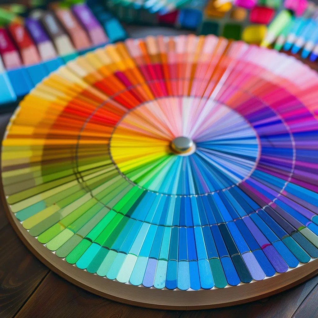
Having access to a full range of colors makes it easier to match your tools to your mood. From calming blues to fiery reds, the right pencils or pens can elevate your emotional connection to the page.
🖍️ See our favorite coloring tools →
Here’s a breakdown of the most common colors and their mood-enhancing properties:
🌿 Green – The Color of Balance & Harmony
Promotes calmness, renewal, and stability. Ideal for nature scenes, forests, and botanical designs.
💙 Blue – The Color of Tranquility & Focus
Creates a sense of peace and clarity, reducing stress and improving concentration. Great for ocean themes and sky elements.
💛 Yellow – The Color of Joy & Optimism
Encourages happiness, warmth, and positive energy. Works well for bright floral designs and cheerful backgrounds.
❤️ Red – The Color of Passion & Energy
Inspires boldness, excitement, and motivation. Use for striking focal points and dynamic color pops.
💜 Purple – The Color of Creativity & Spirituality
Enhances imagination, introspection, and relaxation. Perfect for mystical or fantasy-themed coloring pages.
🖤 Black & Gray – The Colors of Depth & Sophistication
Adds elegance, contrast, and grounding. Best for shading, outlines, or intricate details.
Using Color Psychology in Your Coloring Pages
Now that you know how colors impact emotions, here’s how you can use them strategically in your artwork:
✅ For Relaxation & Mindfulness: Stick to cool tones like blues and greens to create a soothing effect. Ideal for stress relief and calming bedtime routines.
✅ For Energy & Motivation: Use yellows, oranges, and reds to spark creativity and excitement. Great for morning coloring sessions!
✅ For Deep Focus & Reflection: Try purples, dark blues, and muted tones to enhance introspection and concentration.
✅ For Playfulness & Fun: Experiment with bright, high-contrast colors to create a vibrant, uplifting mood.
How to Build a Color Palette for Your Mood
If you want to create intentional, emotion-driven artwork, try these simple color palette ideas:
🎨 Calm & Serene: Light blue, mint green, soft lavender.
🎨 Happy & Playful: Sunshine yellow, coral, bright teal.
🎨 Elegant & Sophisticated: Deep burgundy, charcoal gray, soft gold.
🎨 Mystical & Dreamy: Violet, indigo, moonlight silver.
To bring these palettes to life, we recommend coloring tools with a wide variety of richly pigmented shades. Our handpicked gel pen, marker, and colored pencil sets make it easy to build any mood-driven palette.
🎨 Browse recommended tools for every palette →
Start Coloring with Emotion in Mind!
Next time you color, consider how different shades make you feel and experiment with color combinations that reflect your desired mood.
Want to feel the difference the right tools make? Whether you color for mindfulness, energy, or creativity, having the right pens or pencils can completely change the experience.
✨ Explore our favorite tools to match your mood →
